Case Study
balsa
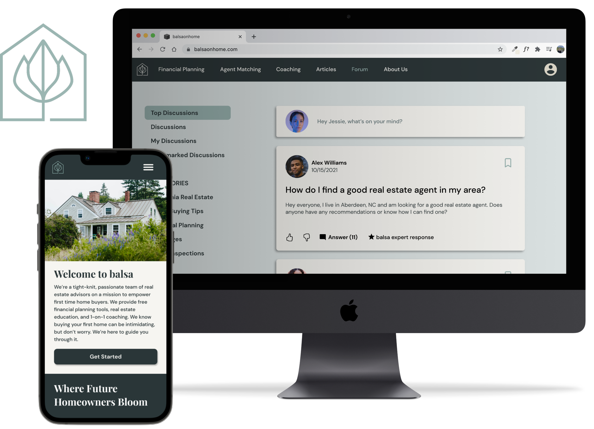
balsa is a real estate startup that specializes in empowering first time homebuyers throughout their journey of buying a house and strives to make real estate more inclusive. My team was tasked with designing a website that would establish balsa’s new look and provide easy access to educational home-buying tools.
Overview
Role
UX/UI Designer
Timeline
August 2021 – October 2021
Problem
Design a website that allows users to efficiently locate what they need. Additionally, establish a new look that communicates company values, and branding that helps balsa standout among the crowd of established competitors.
Goals
1. Establish a coherent and intuitive structure for the site.
2. Establish a personality for the brand that is trustworthy, approachable, and reliable.
3. Make balsa stand out among a sea of well established competitors.
DISCOVER
In order to understand best industry practices and how we could make balsa standout among more established businesses, I conducted competitive and comparative research. To synthesize my findings I conducted feature inventories, content audits, task flows, and a plus/delta analysis on direct and indirect competitors.
Understanding the competition
Next, we focused on better understanding user needs and pain points when searching for a home. After speaking with ten potential users, we synthesized our findings through affinity mapping:
Understanding our users
DEFINE
Based on our research, we were able to create two user personas to focus and inform our design decisions and further empathize with our users. Meet Jessie and Alex!
Who are we designing for?
The home buying process can be overwhelming. I mapped Jessie's emotional journey in order to find key opportunities where balsa could improve her experience.
Based on our synthesized research, I created a site map that enables users to efficiently find what they are looking for in the global navigation. Additionally, we added a user profile and a community forum to the site in order to provide a personalized experience to our users and to make balsa stand out among their competitors.
Information architecture
DESIGN
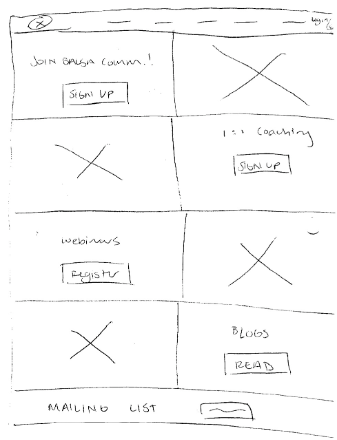
My team designed in low, medium, and high fidelity throughout this process, testing and iterating as we went.
To seamlessly convert our designs to high fidelity I created a style guide to inform our design decisions.
After two rounds of moderated user testing at different levels of fidelity with 12 users, we completed over five rounds of iterations based on the following results.
Usability testing
63%
increase in time to complete account sign up
11%
overall increase in user satisfaction
100%
user success rate
Users thought the flow was intuitive but they expected some kind of onboarding so they know what information they will be expected to enter in the form.
Users loved the color palette and minimal interface, but they found some of the images a little too dark and not optimistic for a site that’s supposed to make the process less overwhelming.
Users didn’t want to have to fill in all of their information at once. They may not have all of the answers, and a long list of questions can be daunting.
Users wanted more context overall. They didn’t fully understand the value of the services balsa offered, and some of the wording in the global navigation was too vague.
DELIVER


